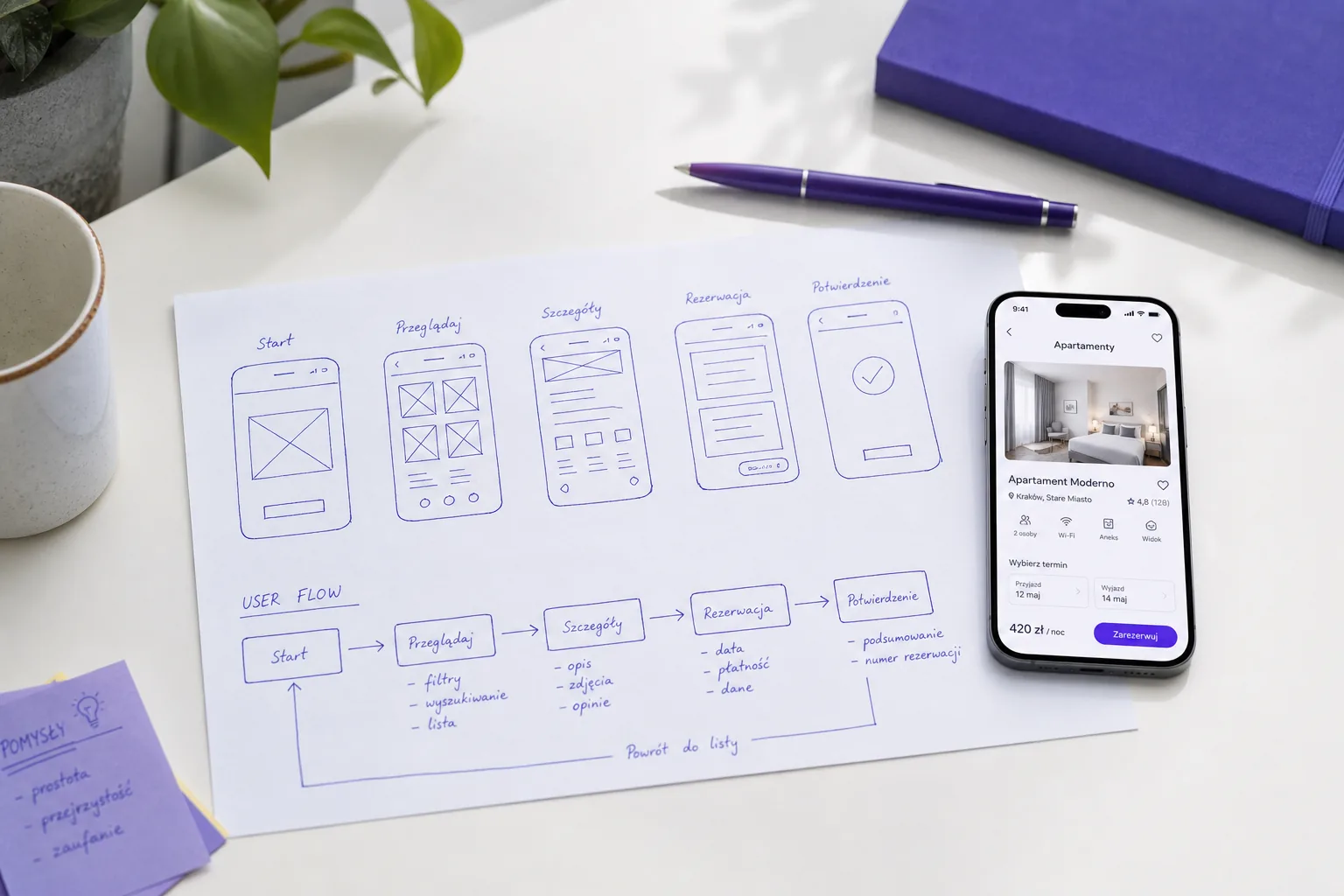
Mobile-First Design: Why It Decides Whether You Win the Customer

Picture the last time you looked something up. There is a good chance you did it on your phone — perhaps standing in a queue, sitting on the sofa, or half-watching the television. This is how most people now meet businesses online: on a small screen, with one hand, in a hurry. If your website was designed for a spacious desktop monitor and merely squeezed down to fit a phone, you are asking the majority of your visitors to work harder than they should. And in a world of endless alternatives, people do not work hard. They leave.
Mobile-first design flips the traditional approach on its head. Instead of building for a big screen and hoping it survives the shrink, we design for the phone first and expand outward. That single change in mindset produces sites that feel natural where most of the traffic actually is. Here is why it matters and how we approach it at Eurolingo.
Mobile is where your customers already are
For most businesses, mobile devices account for the larger share of website visits, and often the larger share of first-time visitors too. Someone discovering you through a search, a social post or a link from a friend is very likely to arrive on a phone. That first encounter sets the tone for everything that follows. If it is cramped, slow or fiddly, you may never get a second chance to impress them on a desktop.
There is a search dimension as well. Google predominantly uses the mobile version of your site to understand and rank it. In practice this means the mobile experience is not a lesser sibling of the desktop site — it is the version that counts most. A weak mobile experience is a weak experience, full stop.
Designing for the small screen first
Starting with the phone imposes a healthy discipline. A small screen has no room for clutter, so it forces you to decide what genuinely matters. When we design mobile-first, the essentials rise to the top: what you offer, why it is worth caring about, and the single most useful next step. Everything that does not serve the visitor's goal gets questioned.
That clarity is a gift. Pages become more focused, messages become sharper, and the path to enquiry or purchase becomes obvious. When we then expand the layout for tablets and desktops, we are adding breathing room and richness to a design that already works, rather than desperately trying to rescue one that does not.
If your message survives on a phone screen, it will thrive everywhere else. The small screen is the honest test of whether your design earns its keep.
Thumbs, not cursors
On a desktop, people navigate with a precise mouse pointer. On a phone, they use a thumb — a blunt instrument reaching across a screen held in one hand. Designing for the thumb changes a lot of small decisions that add up to a big difference in how usable a site feels.
- Tap targets need to be generously sized so they are easy to hit without zooming
- Important actions belong within comfortable thumb reach, towards the lower and central parts of the screen
- Buttons and links need enough space between them to avoid accidental taps
- Menus and forms should be simple to operate one-handed, without pixel-perfect precision
When a site respects how people actually hold their phones, using it feels effortless. When it ignores that, every interaction carries a little friction — and friction is where sales quietly slip away.
Performance is part of the design
Phones are not always on fast, reliable connections. People use them on patchy mobile data, on crowded networks and on older handsets. A design that looks beautiful on a fast office connection can feel painfully slow in the real world. That is why we treat performance as a design consideration, not an afterthought.
In practice that means serving appropriately sized images, keeping scripts lean, and making sure the most important content appears quickly rather than after a long wait. A mobile visitor who has to stare at a blank screen is a mobile visitor with their thumb hovering over the back button. Fast pages keep people engaged long enough to become customers.
Common mobile mistakes we see
When we audit sites, the same avoidable problems come up time and again. If any of these sound familiar, your mobile experience is probably costing you business:
- Text so small that visitors have to pinch and zoom to read it
- Pop-ups that cover the whole screen and are almost impossible to close on a phone
- Buttons crammed together so the wrong one gets tapped
- Horizontal scrolling because a layout was never truly adapted for narrow screens
- Long, awkward forms that are a chore to complete with a thumb
- Key information and calls to action buried far down the page, out of easy reach
- Hover-based menus that simply do not work on touch devices
None of these are difficult to solve, but each one nudges a visitor closer to giving up. Fixing them is often the fastest way to recover conversions you did not even realise you were losing.
Win the customer on the screen they are actually using
Mobile-first design is not a trend or a technical box to tick. It is simply meeting people where they are, in the way they naturally behave. When your site is quick, clear and comfortable to use with a thumb, you make it easy for someone to choose you — and ease is persuasive.
If you suspect your website is letting you down on mobile, we can help you find out and put it right. Get in touch with Eurolingo for a mobile-first review, and let's make sure your site wins the customer on the very first tap.
Got a project in mind?
Turn the reading into action. Tell us about it — we'll help design your site and build its visibility in Google.
Free quote